Photo album books overflowing with loose photos, corners bent, and captions faded with time – that’s a scene from the past. Today’s photo books offer a modern and elegant solution to preserve your cherished memories. But with the excitement of creating a beautiful photo book, some crucial details can slip through the cracks. Here, we’ll guide you through common photo book mistakes to avoid, ensuring your treasured moments are showcased in a stunning and lasting format.
Mistake #1: Neglecting Photo Quality
The foundation of any good photo book is high-resolution photos. Grainy, pixelated images will translate poorly to print, diminishing the overall impact of your book.
Resolution Matters: Always use high-resolution photos downloaded directly from your camera or phone. Avoid using heavily compressed images from social media platforms.
Check Before You Click: Zoom in on your chosen photos to ensure details are sharp and clear. Blurry or out-of-focus images won’t translate well to print.
Editing is Your Friend: At PikPerfect, we include basic photo editing with all of our photo book designs, adjusting brightness and contrast, removing red eye, straightening and cropping photos for a more polished look.
Scan, Don’t Click: If you would like to include older non-digital photos in your photo book, It’s possible to just take a picture of the photo using your camera phone, however the quality will never be as good as scanning the image. If you do not have a scanner, but still want better quality photo captures, a good compromise is using a scanner app such as Google PhotoScan, Microsoft Lens, Adobe Scan, and Pic Scanner.

Mistake #2: Overcrowding Your Photo Book Pages
Overcrowded pages create a cluttered and overwhelming experience for viewers. Luckily, at PikPerfect, we offer photo books with up to 300 pages, allowing you to easily display around 1000 images. However, if you prefer the layflat or premium flushmount photo album books, you would need to whittle down your photos somewhat. Consider the following guidelines when curating photos:
Focus on Quality, Not Quantity: Curate your photos carefully, selecting the ones that best capture the essence of a moment or event.
Let Your Photos Breathe: Allow for ample white space around your photos. This creates a sense of balance and allows each image to stand out.
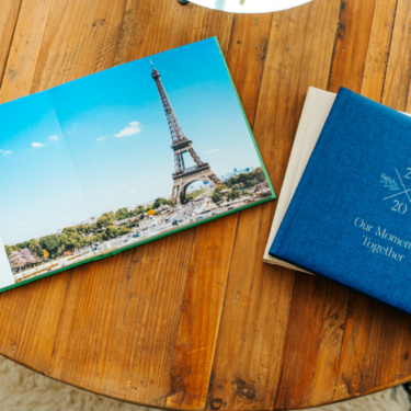
Consider Single Photos: For particularly impactful images, dedicate an entire panoramic spread across 2 layflat pages, to showcase its beauty and detail.

Mistake #3: Forgetting the Power of Storytelling
A well-curated photo book tells a story or captures a specific theme or event. Failing to establish a cohesive narrative can result in a disjointed and confusing book. Whether it’s a milestone photo book, a vacation, or family reunion, ensure your photo book has a clear theme or storyline that guides the viewer through the pages.
Captions are Key: Don’t underestimate the power of captions! Identify individuals in photos, include dates and locations, and add short anecdotes to jog your viewers’ memories. However, while captions can enhance the storytelling aspect of your photo book, be mindful of overcrowding pages with too much text. Long paragraphs or excessive captions can overwhelm the viewer and distract from the main focus—your photos.
Chronological Flow: Arrange photos and captions chronologically to create a clear timeline of events. This helps viewers follow the story and understand the context of each image.
Group Similar Photos Together: Sort your photos into categories based on common themes, events, or locations. Grouping similar photos together will help create a sense of continuity and flow throughout the photo book.
Mix It Up: Don’t be afraid to mix different types of photos within a theme, such as candid shots, posed portraits, and scenic views. Variety adds visual interest and keeps the viewer engaged as they flip through the pages.

Mistake #4: Ignoring Design Consistency
A cohesive design aesthetic elevates your photo book from a collection of photos to a professionally crafted masterpiece.
Theme it Up: Choose a color palette or theme that complements the overall mood of your photos. Consistent use of color creates a visually pleasing and unified experience.
Font Fundamentals: Select fonts that are easy to read and complement your chosen theme. Avoid too many fonts or overly decorative styles.
Background Matters: Utilize subtle background patterns or textures to add visual interest without distracting from the photos. Keep backgrounds simple and consistent throughout the book.
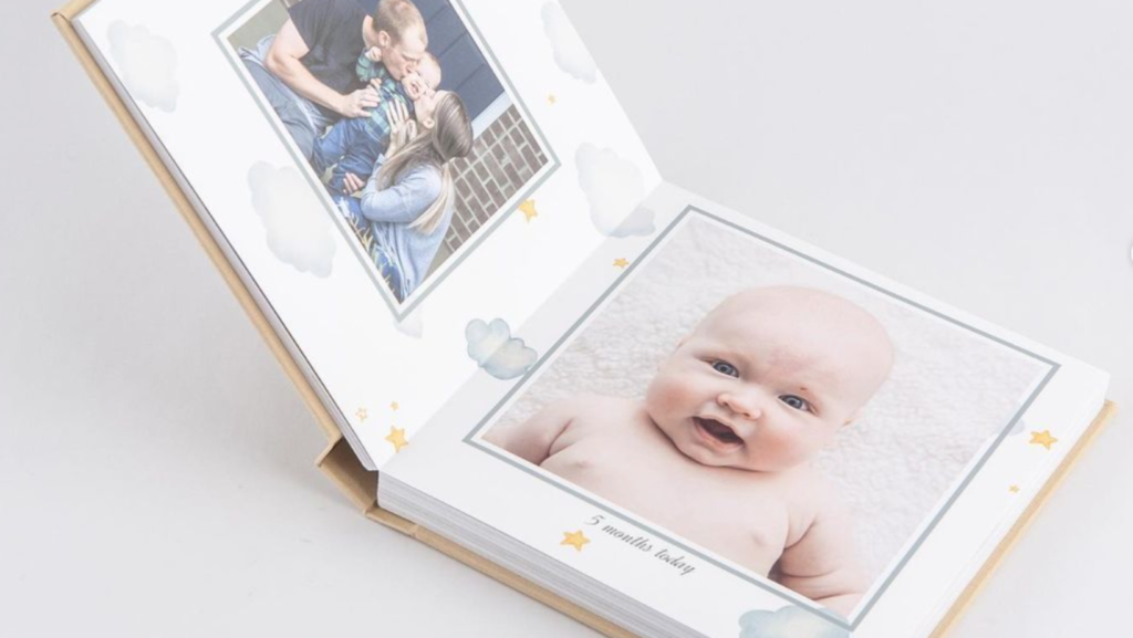
Pro tip: Choose from a wide range of pre-formatted photo book layouts such as romantic, foliage, chalkboard, color-block, playful, timeless, minimalist, and others, when designing your photo book with PikPerfect, or have one of our designers create a cohesive customized layout to exactly match your design specifications and photo book theme.
Mistake #5: Neglecting Printing and Binding options
The choice of printing and binding options can significantly impact the durability and overall presentation of your photo book. Neglecting to consider these factors may result in a finished product that doesn’t meet your expectations. Here is what to consider:
Paper Quality: Choose high-quality, archival paper that will resist fading and wear over time. Opt for thicker paper for a more luxurious feel and enhanced photo vibrancy. At PikPerfect, the papers of our layflat photo albums and photo books are FSC certified eco-friendly, developed to withstand the test of time, and printed on high-end inkjet printers on 200g matte paper. Our premium photo album books are printed on silver halide paper, which offers the widest range of colors, highly accurate skin tones and outstanding density, making it the perfect choice if you’re after the best that money can buy.
Binding Options: Consider your desired aesthetic and book usage. At the cheapest end of the spectrum are spiral bound photo books, while PUR binding, in which the inner pages are glued together at the spine, is more common. Layflat binding is ideal for panoramic photos with pages that lie completely flat. In this case, the pages are printed in seamless spreads which are then glued back to back, meaning that images do not get “lost” in the fold.
Durability: Think about how your photo book will be used. If it’s intended for frequent coffee table browsing, a more durable PUR hardcover or layflat binding might be preferable. Also consider opting for leather-covered photo album books for their enhanced durability and quality.

Mistake #6: Not Proofreading Your Photo Book Keepsake
While it’s easy to focus solely on the visual aspects, don’t overlook the importance of proofreading the text throughout your book. A typo or factual error can be a real buzzkill in a beautifully crafted photo book. Take the time to proofread meticulously before placing your order.
Double (and Triple) Check: Proofread captions, dates, and any text elements for typos, spelling mistakes, or grammatical errors.
Enlist a Second Pair of Eyes: Ask a friend or family member to proofread your book for any errors you might have missed.
Focus on Details: Check photo placement, ensure margins are consistent, and verify that all design elements are aligned properly.
Keep these tips in mind when starting your photo book creation journey and we guarantee a durable keepsake that you will treasure for years to come.

